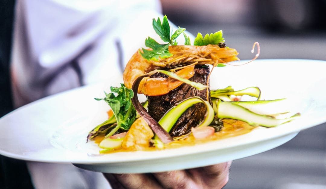
If you’re a regular to the refined restaurant scene, you’ll no doubt have looked in awe on occasion at some of the artfully presented plates of food that are placed in front of you. You’ll know that the way the ingredients are displayed has been carefully considered and it all adds to the diner’s experience, especially in a world where those food photos hit Instagram in record time.
If you’ve ever wondered what it takes to make these dishes reach the exquisite level they are, don’t worry! Here are a few tips to make your dishes look just as beautiful as they do in Michelin-starred restaurants.
1. Choice of dish
")
Choose the plate, bowl or saucer that complements the food and how you plan to consume it, as well as which one might look more appealing. When in doubt, always choose a plain white plate or bowl; a blank canvas is ideal to work with.
“Dishes should never be allowed to overshadow the food that sits on them.”
– Nigel Slater.
2. Odd numbers:
")
A basic design principle that applies to most visual art. Odd numbers are more organic and more attractive than something arranged in pairs that looks too symmetrical and artificial.
3. Geometry / shapes
")
Creating shapes on a plate, such as a circular area of sauce or placing items in a row, is appealing to the eye. Our brains visually group things together and create continuity according to Gestalt Principles, so incorporating this into food presentation helps make a dish more appealing.
4. Negative Space
Leaving areas of plate empty when creating a dish allows the eye to discern details and absorb what is present. When a plate is full it is difficult to absorb the different elements without space to let them breathe. Having negative space around the subject creates definition and proportion.
“White space is like a canvas: it’s the background that holds the elements together in a design, allowing them to stand out.”
– Mads Soegaard.
5. Colors
This will depend on what you’re cooking, but you can still think about it. If you create a dish heavy with certain colors, think about the color spectrum and what might complement them. Or you can stick with a color story and use different shades and tones within that.
6. Contrast

Contrasting textures, flavors and shapes in a dish create interesting dynamics, sophistication and balance. Diverse textures are visually interesting, but also profoundly important for edible enjoyment. If the dish is primarily creamy in texture, make sure there is a contrasting crunch, crumble or crunch to cut through those silky textures. This also applies to flavor, if everything is sweet or rich, make sure there is also acidity to provide a counterpoint.
7. Height

Photographs Pexels.
Creating some varying heights, layers and dynamics with the ingredients on the plate increases interest and energy and keeps it from literally falling apart.